Every artist website will have a feed of works in the form of a gallery at some point, but what are the image gallery layouts available and which is the best to show off your artwork the best?
Feed
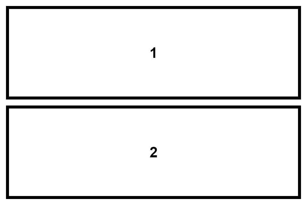
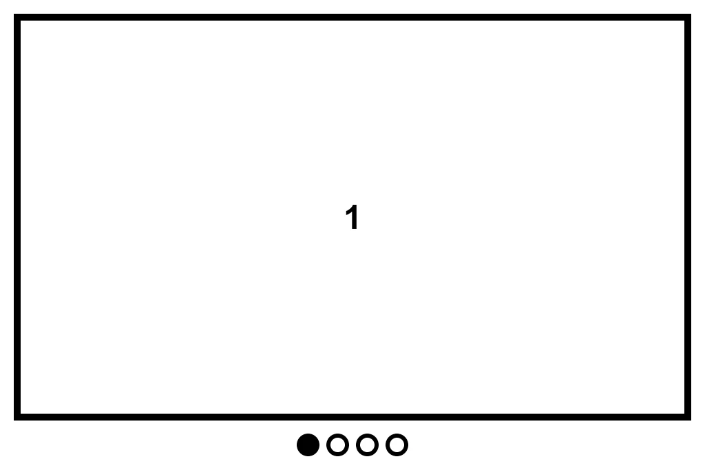
A feed is as simple as a layout gets – one image on top of another, presented in a single column.
Almost all image gallery layouts will rely on a feed layout. Less likely on a desktop computer, but once you get down to the limited space of a mobile phone, it is virtually the only option.
Instagram uses a feed layout of course and people are very much conditioned to scrolling up and down a page.
I would always recommend extending your images to the full width of the small screen to get your image as large as possible on mobile.
A feed gallery layout can also be a very effective way of displaying artworks in a blog-like layout on desktops.
Grid
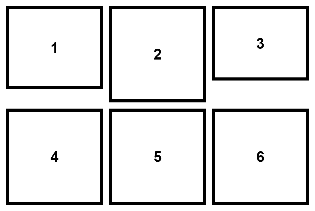
Grid is the all time classic in art gallery website layouts. Clean, organised and with plenty of white space available to give your work to breathe. Modern artists love the grid.
Beginners, or those short on time to develop their website should opt for a grid. It’s a classic for a reason.
Masonry

Masonry, as the name suggests resembles a brick layout. If you’ve ever used Pinterest then you have seen the masonry layout in action. Google Image Search also uses a version of masonry, but in my opinion not to such a visually successful degree.
I would use masonry to eliminate white space and to get the maximum screen area covered in images. Therefore, its suitable for high energy sites.
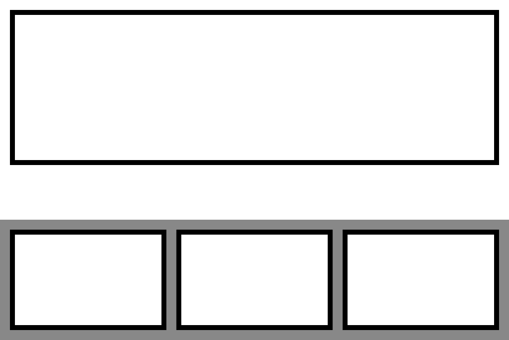
Columns
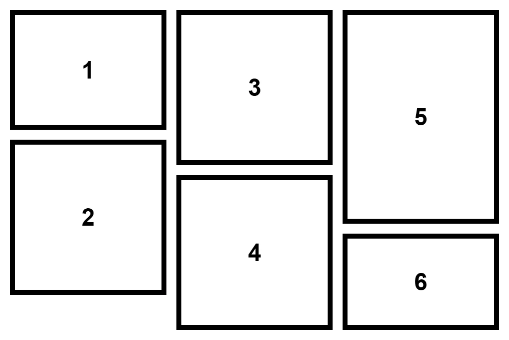
A column layout is what I use on my own website galleries. I’ve implemented it as a quicker alternative to the masonry layout.
The images and/or content reads like the column in a book or newspaper – top to bottom and then top to bottom in the next column on the right.
The works in my gallery are in reverse chronological order (like many an artist website). The limitation to columns is that newer works can slide down the page, whilst older or images middling in age will come to the top of the second and third column. I’m happy enough with that, but something to consider.
I like the column layout as it affords more space to my images than I would have achieved with a grid layout.
Slideshow
Slideshows allow you to show a procession of images in a small space. They can be animated or users can navigate through them navigation buttons, thumbnails or swiping.
I would never use a slideshow to present a feed, gallery or archive of artworks and would restrict use to displaying multiple images of the same artwork.
Many artists feature slideshows at the top of a home page. I think that’s ok, but prefer a layout where you can see multiple artworks at the same time like you would in a physical gallery, or in a book.
Composition
Composition is a phrase I’m using to describe when you manually compose a layout of your artwork images, rather than relying on any of the layouts above.
Technically therefore, it can’t be (easily) automated for a gallery or image feed. But it could be a grouping of different layout systems.
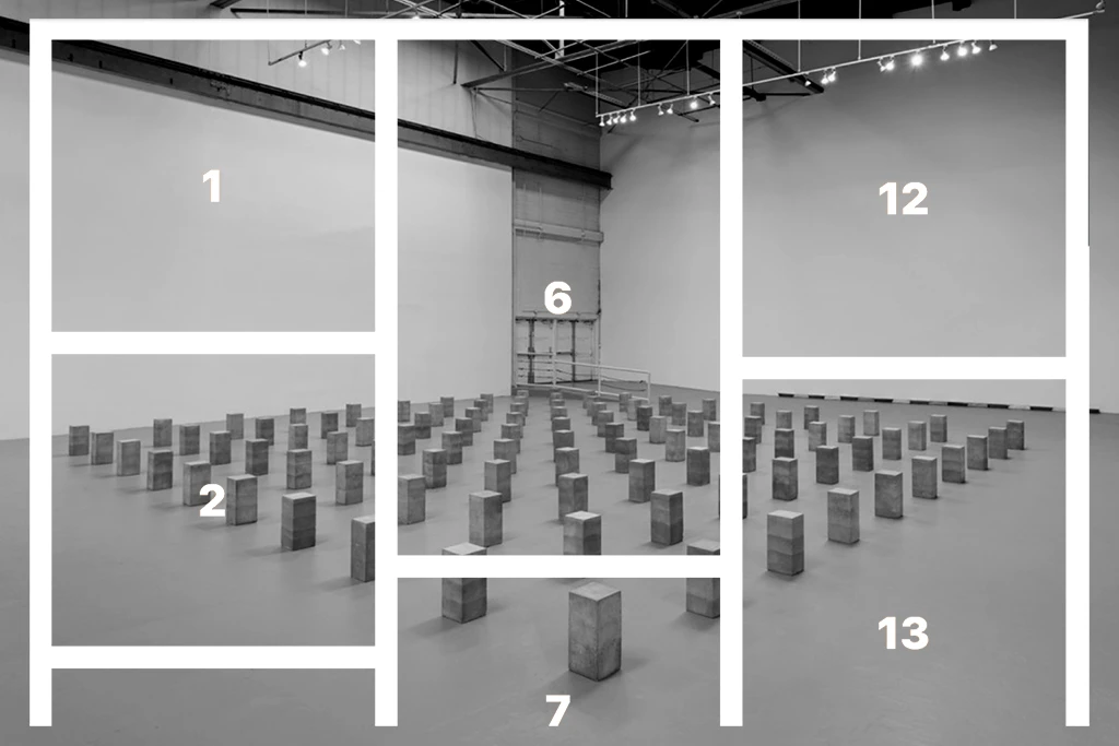
Websites like Hauser & Wirth do it very nicely, and it’s more akin to a print layout that you may find in a magazine or exhibition catalogue.
For most artists I would recommend leaving this for your home page or other key feature page.
The addition of the Gutenberg block editor in WordPress has made this kind of layout much more achievable in recent times, and within the skillset of most novice web users.
Image Gallery Layouts – A Conclusion
We’ve explored a number of different options to achieve successful image gallery layouts.
Which one you decide to choose will depend on which layout you think best shows off your work and complements its style and meaning.
If you would like further advice on image gallery layouts, please do comment below or contact me.
Leave a Reply
You must be logged in to post a comment.